Line Chart Presentation Templates and Slides – Free & Premium for PowerPoint, Canva & Google Slides
Download free line chart presentation templates for PowerPoint, Canva, and Google Slides. Show trends, forecasts, and comparisons with clean, editable line charts ⬇️
Explore the Best Line Chart PowerPoint Templates, Google Slides & Canva Line Chart Themes
✨ Line chart slides are made for showing how numbers change over time, so your audience can spot trends quickly. Use them to explain growth, seasonality, forecasts, and progress against goals with clean visuals that stay readable on screen.
They’re perfect for KPI reporting, marketing and sales trends, financial updates, product analytics, and classroom progress tracking. For example, compare actuals vs targets across months, then add one callout to highlight the turning point that explains the change.
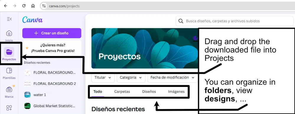
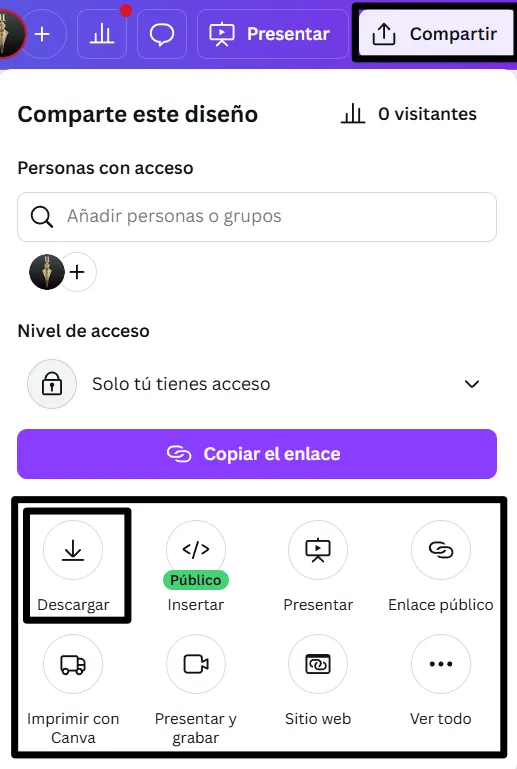
Edit these layouts in PowerPoint, Canva, and Google Slides, then present live or export to PDF for reports and sharing. Paste data from Sheets or Excel, adjust axes and labels, and keep styling consistent across the deck.
Readability tip: limit the chart to a few lines, label key points directly, and keep gridlines subtle so the trend stands out.
Best for:
- Trend and forecast presentation slides
- Actual vs target reporting
- KPI dashboards and monthly updates
- Growth and performance storytelling
- Progress tracking for projects or classes
Explore related templates:
❓ FAQs
Are these line chart presentation templates free to download?
Yes—this tag includes free line chart presentation templates. If a template is premium, it will be clearly labeled on its template page.
What is a line chart presentation template?
An editable slide set for time-based charts, including trend lines, targets, and callouts, designed for clear reporting and storytelling.
When should I use a line chart vs. a bar chart?
Use line charts for trends over time and rate changes, and use bar charts for comparing separate categories or discrete values.
How do I keep line charts readable?
Limit series to 2–4 lines, label key points, keep gridlines light, and avoid heavy legends when direct labels work better.
Do these slides work in PowerPoint, Canva, and Google Slides?
Yes, you can edit the slides in PowerPoint, Canva, and Google Slides, present live, and export to PDF for sharing.
What should I annotate on a trend chart?
Add one or two callouts for key events, like a campaign launch or pricing change, so viewers understand why the line moved.